Optum Worker's Comp Website
I managed the migration to a new website platform (AEM) and designed and launched the company’s new website in three months.
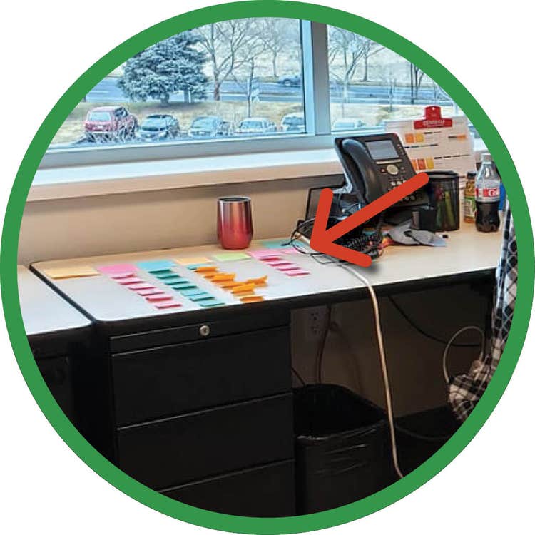
With excessive use of Post-it notes (a mighty obsession), I mapped out the old site pages, set new site navigation, and combined pages better suited to page sections rather than individual pages.

Before
Defined our audience and our site goals.
- Easier to navigate. First and foremost, for industry professionals while making specific content geared to injured persons easy to find and not buried in sub-menus.
- More frequent access to our educational and industry resources and more calls to action.
- Clean up the design and create a better user experience.

After
Designed a site that reflected our new goals.
- The navigation was significantly cleaned up. Relevant content was moved off dozens of small sub-pages and brought to the main pages. The pharmacy locator was moved into the main navigation as one of the most frequently used pages.
- A sidebar was added on each page to consistently display related content and provide a way to naturally cross-link to important information.
- The grid system is used to align content and leave more breathing room consistently. Site text was given some extra room to be more readable.

Site Guidelines Through Rebranding
In late 2021 through 2022, Optum embarked on a rebranding journey. The site's use of a grid system and consistent layouts made the transition easy. Creating a good foundation made long-term management of the site more accessible.
